

In this guest post, Allison Keasal, owner of Forget Me Knot Events, shares her ideas for incorporating “Classic Blue,” the 2020 Pantone Color of the Year, into your Lake Tahoe wedding.
As we continue further into this unprecedented year of 2020, there is no better color than Pantone 19-4052, aka “Classic Blue,” to represent what we need more than ever now: calmness, confidence, and connection. Resembling the sky at dusk with a slightly muted blue hue, Classic Blue is a restful color which brings us a sense of peace and tranquility while also promoting focus and clarity. Perhaps even more importantly, it is also said to encourage resilience.
As Pantone describes: “Instilling calm, confidence, and connection, this enduring blue hue highlights our desire for a dependable and stable foundation on which to build as we cross the threshold into a new era.” Clearly Classic Blue offers the perfect intention for beginning your marriage and also pairs beautifully with Lake Tahoe (affectionately known as “Big Blue.”) So how do you incorporate this color into your wedding?

There are a million different ways we can incorporate Classic Blue into your color palette, whether as a primary color or an accent color. Below are just a few ideas of how you can incorporate this hue throughout your design.
PAPER
There are so many directions you can take when it comes to incorporating color into your stationery, day-of details, and all things paper. Adding accents of Classic Blue on your invitations and RSVP card, a custom wax seal, custom cocktail napkins, menus, and signage can really help set the tone for your entire event. First impressions truly are the most important impressions!
FURNITURE & DECOR
Think about tying in accent chairs or couches in the Classic Blue color to create a lounge set that incorporates not only your primary colors but your accent colors as well.
There are numerous ways to use your table linens to add an accent color. If you are looking to tie in a bold pattern to your overall design, this is the perfect place to start. Or, If you want to stay on the more classic and traditional side, incorporate a blue runner or napkin to add pops of color while not being a focal point.
One of our favorite ideas for incorporating blue into your tablescape is using Delftware or Chinoiserie in your floral vessels, plateware & small details. This is such a unique way to incorporate blue while also adding in texture and patterns to your overall design. It’s perfect for those who want a classic and timeless look.
APPAREL
We love it when a bride dons a pair of classic blue shoes, creatively bringing in an accent color and honoring the tradition of sporting “something blue. “
And yes, you can also go blue with your wedding dress! More brides are thinking outside of the box and deviating from the traditional white/ivory dress. Colored dresses are making a come back and really leave your guests astounded!
PATTERNS
There are so many great patterns that incorporate classic blue and offer creative elements to your aesthetic. Picking a pattern is a great way to determine your overall style & color palette as you can pull colors from it to create your look. Look at artwork, wallpapers, and even architectural influences to find a pattern that encompasses the classic blue hues but also incorporates your other favorite colors.
As a planner, one of my favorite things to do when developing a design is to select colors and details that contribute to the overall story of the couple. When it comes to Classic Blue, it represents so much which makes it especially easy to incorporate into their story line. We also encourage accents of blue when hosting a wedding in Lake Tahoe because, if you take a moment to look around, you will see how big of an influence blue plays in our natural surroundings.
Colors also have a way of evoking emotions and thoughts in people so we feel when you use blue you are setting a very calm, confident vibe and giving your guests a foundation to begin connecting with each other. It is truly amazing how selecting colors can influence the overall atmosphere of your wedding!
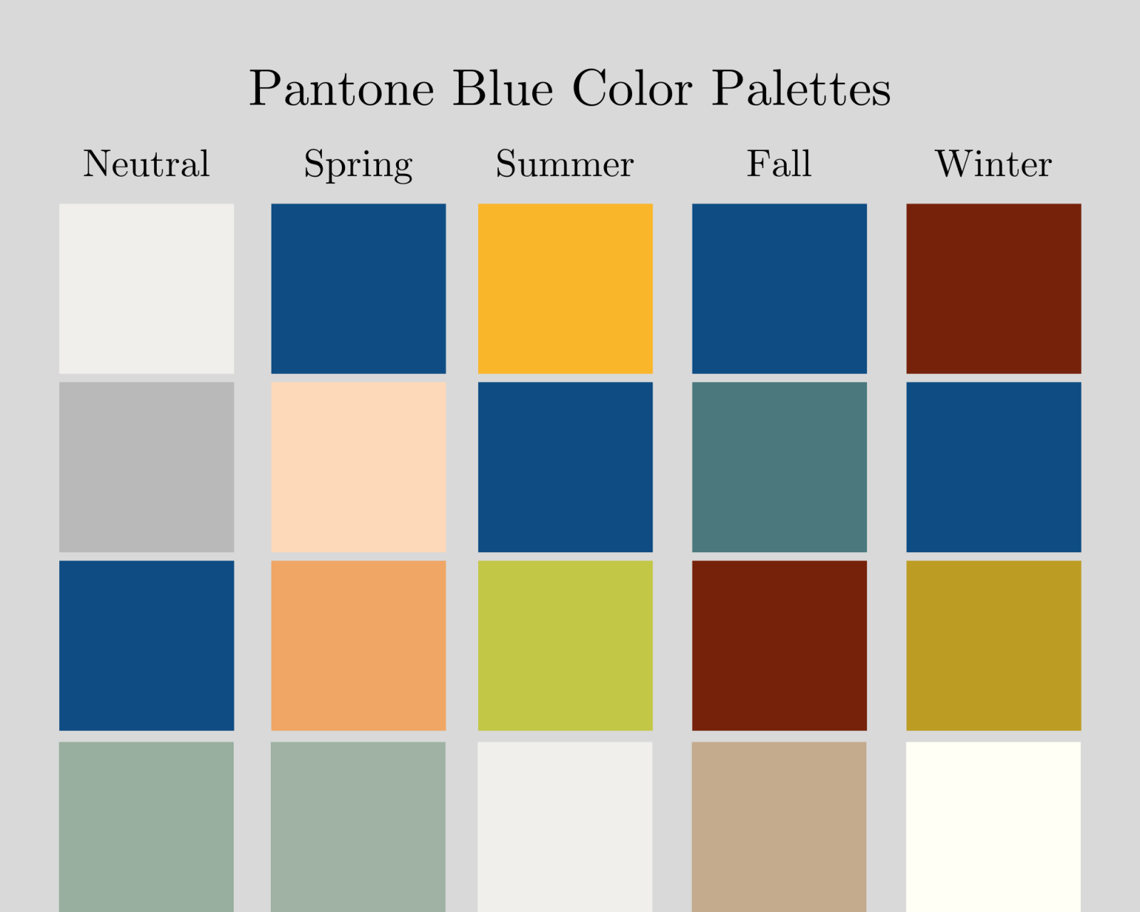
The great thing about Classic Blue is its versatility throughout the seasons and ability to combine with a wide variety of colors. This allows us to constantly dream up new ideas of how to incorporate it and always keep a fresh take on color palette. Below are some of the combinations we think are stunning!
-
Keep it neutral! This is great to use year round and fits seamlessly into any time of the year.
-
As we move into spring we are looking at incorporating peaches and oranges to pay homage to the newly blossoming surroundings, giving Classic Blue new life.
-
Summer is full of sunshine and brightness, so we mix in chartreuse and a deep yellow that compliments the blue nicely while representing what summer is all about – warmth and brightness.
-
Fall is a time of transition so we bring in a slightly different shade of blue to represent the changing of the seasons, with accents in classic fall colors.
-
The last season of the year is Winter so we suggest a more glam/holiday inspired palette of deep burgundy, golds, and, of course, white.

To learn more about Allison and Forget Me Knot Events and Design, check out their vendor profile on Tahoe Unveiled.